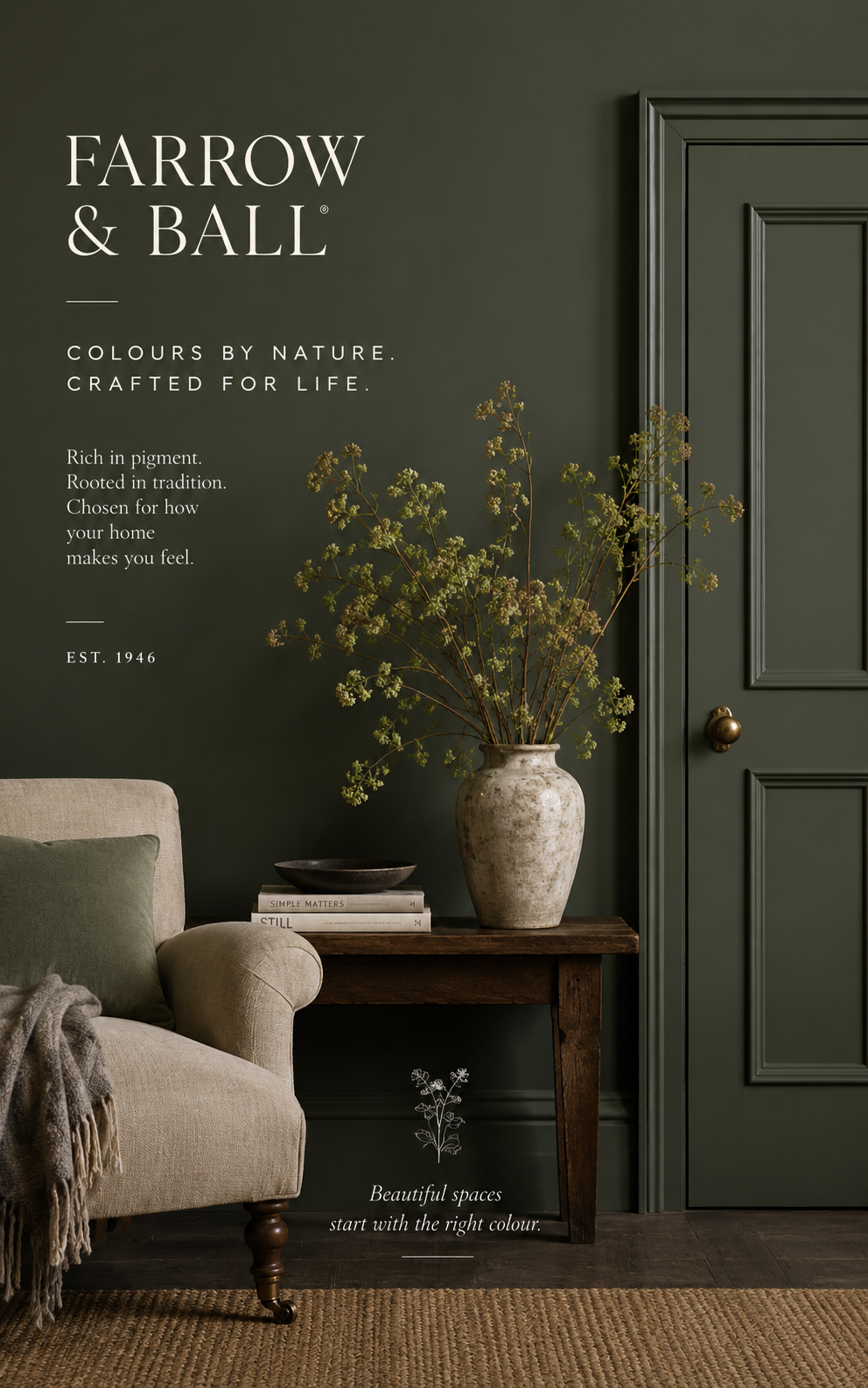
Farrow & Ball: Transforming Homes with Timeless Color and Luxury Design
When it comes to premium paint and sophisticated interior design, few names command as much respect as Farrow and Ball. Renowned for its rich pigments, exceptional depth of color, and timeless aesthetic, Farrow and Ball has become a favorite among homeowners, interior designers, architects, and design enthusiasts worldwide.
Whether you’re renovating an entire home, refreshing a single room, or searching for the perfect paint shade, Farrow and Ball offers a curated collection of colors that elevate any space. From historic neutrals to dramatic dark hues and soft contemporary tones, the brand has transformed the way people think about paint and interior styling.
In this comprehensive guide, we’ll explore the history of Farrow and Ball, its most popular colors, decorating strategies, paint finishes, current trends, and practical tips for incorporating these luxurious shades into your home.
What Is Farrow & Ball?
Farrow & Ball is a premium British paint and wallpaper manufacturer known for producing high-quality, richly pigmented paints using traditional methods and carefully selected ingredients.
Founded in Dorset, England, the company has built its reputation around:
- Exceptional color depth
- Eco-conscious formulations
- Heritage-inspired palettes
- Luxury wallpaper collections
- Artisan craftsmanship
- Timeless interior design solutions
Unlike many mass-market paint brands, Farrow and Ball focuses on creating colors with extraordinary complexity, allowing them to change subtly throughout the day depending on natural light conditions.
Why Homeowners Love Farrow & Ball
- Rich Pigment Quality
One of the biggest advantages of Farrow and Ball paints is their high pigment concentration. This creates depth, richness, and movement that standard paints often fail to achieve.
Colors appear softer, more sophisticated, and more dynamic under changing light conditions.
- Timeless Color Palette
Rather than offering thousands of shades, Farrow and Ball carefully curates a collection of colors designed to work harmoniously together.
This simplifies the decorating process and helps homeowners achieve professional-looking results.
- Heritage and Character
Many Farrow and Ball shades are inspired by:
- Historic architecture
- Traditional English interiors
- Natural landscapes
- Historic design periods
These influences create a sense of authenticity and timelessness.
- Designer Approval
Many of the world’s top interior designers regularly specify Farrow and Ball paints for luxury residential and commercial projects.
Most Popular Farrow & Ball Paint Colors
Hague Blue
Hague Blue is one of the most iconic Farrow and Ball colors.
This dramatic deep blue creates:
- Sophisticated dining rooms
- Elegant home offices
- Luxurious kitchens
- Statement cabinetry
Its rich undertones add depth and warmth while maintaining a contemporary feel.
Railings
Railings is a softer alternative to pure black.
Characteristics include:
- Blue undertones
- Modern appearance
- Architectural sophistication
- Versatile styling potential
Many designers use Railings for:
- Interior doors
- Kitchen islands
- Accent walls
- Exterior trim
Elephant’s Breath
Elephant’s Breath remains one of the brand’s most beloved neutral colors.
This warm gray shade works beautifully in:
- Living rooms
- Bedrooms
- Hallways
- Open-plan spaces
Its subtle warmth prevents rooms from feeling cold or sterile.
Skimming Stone
Skimming Stone offers a soft greige appearance.
Benefits include:
- Exceptional versatility
- Elegant warmth
- Timeless appeal
- Excellent pairing options
It works particularly well in homes seeking a calm and minimalist aesthetic.
Green Smoke
Green Smoke is a smoky green with blue undertones that brings character and sophistication.
Ideal spaces include:
- Kitchens
- Libraries
- Home offices
- Dining rooms
Its moody elegance creates a luxurious atmosphere.
Choosing the Right Farrow & Ball Finish
Color is only one part of the equation. Selecting the appropriate finish is equally important.
Estate Emulsion
Perfect for:
- Living rooms
- Bedrooms
- Ceilings
Features:
- Chalky appearance
- Ultra-matte finish
- Rich color depth
Modern Emulsion
Best for:
- Family homes
- Kitchens
- Bathrooms
Benefits:
- Washable surface
- Durable performance
- Moisture resistance
Modern Eggshell
Ideal for:
- Woodwork
- Floors
- Furniture
This finish offers durability while maintaining elegance.
Full Gloss
Suitable for:
- Statement doors
- Cabinetry
- Architectural details
The reflective surface creates dramatic visual impact.
Decorating with Farrow & Ball Colors
Creating a Luxurious Living Room
Living rooms benefit greatly from layered Farrow and Ball colors.
Popular combinations include:
- Hague Blue with brass accents
- Skimming Stone with natural wood
- Railings with white trim
- Green Smoke with linen textures
Adding velvet cushions, textured rugs, and warm lighting enhances the luxurious feel.
Designing a Relaxing Bedroom
Bedrooms should promote comfort and tranquility.
Recommended Farrow and Ball colors:
- Setting Plaster
- Skimming Stone
- Ammonite
- Dimity
Pair these shades with:
- Soft textiles
- Natural wood furniture
- Neutral bedding
- Warm lighting
Transforming Kitchens
The kitchen has become one of the most popular spaces for Farrow and Ball colors.
Trending choices include:
- Green Smoke cabinets
- Hague Blue islands
- Railings lower cabinets
- Off-White walls
These combinations create timeless kitchens that remain stylish for years.
Farrow & Ball Color Trends for Modern Homes
Nature-Inspired Greens
Green continues to dominate interior design.
Popular options include:
- Green Smoke
- Calke Green
- Breakfast Room Green
These colors connect interiors with nature and create calming environments.
Warm Neutral Shades
Warm neutrals are replacing cooler grays.
Top choices include:
- Skimming Stone
- Joa’s White
- Shaded White
- School House White
These tones create inviting spaces.
Deep Moody Colors
Dark colors are increasingly popular for creating drama and sophistication.
Examples include:
- Hague Blue
- Railings
- Down Pipe
- Studio Green
These shades work especially well in dining rooms and home offices.
How Lighting Affects Farrow & Ball Paint Colors
One of the defining characteristics of Farrow and Ball paints is how dramatically they respond to light.
North-Facing Rooms
These spaces receive cooler light.
Recommended shades:
- Strong White
- Skimming Stone
- Elephant’s Breath
These colors help balance cooler conditions.
South-Facing Rooms
South-facing rooms receive warm sunlight.
Ideal choices include:
- Ammonite
- Wimborne White
- School House White
These shades remain balanced throughout the day.
East-Facing Rooms
Morning light enhances warm undertones.
Good options include:
- Setting Plaster
- Pink Ground
- Dimity
West-Facing Rooms
Afternoon sunlight intensifies warm colors.
Recommended shades:
- Green Smoke
- Hague Blue
- Railings
Farrow & Ball for Small Spaces
Small rooms can benefit enormously from thoughtful color choices.
Popular strategies include:
Paint Walls and Trim the Same Color
This creates visual continuity and makes rooms feel larger.
Use Mid-Tone Colors
Mid-tone shades often create more depth than stark white.
Embrace Dark Colors
Contrary to popular belief, darker shades can make small rooms feel cozy and sophisticated.
Popular choices:
- Hague Blue
- Railings
- Down Pipe
Pairing Farrow & Ball with Furniture and Décor
To maximize the impact of Farrow and Balls colors, consider complementary materials.
Natural Wood
Works beautifully with:
- Skimming Stone
- Ammonite
- Elephant’s Breath
Brass and Gold
Perfect with:
- Hague Blue
- Railings
- Green Smoke
Marble
Luxury marble surfaces pair exceptionally well with:
- Strong White
- School House White
- Wimborne White
Linen and Cotton
Natural fabrics soften darker colors and add warmth.
Sustainable and Eco-Friendly Benefits
Modern homeowners increasingly value sustainability.
Farrow supports eco-conscious living through:
- Water-based paint options
- Low VOC formulations
- Responsible manufacturing practices
- Long-lasting finishes
Choosing premium paint often reduces the need for frequent repainting, contributing to a more sustainable home.
Common Mistakes to Avoid
Ignoring Lighting Conditions
Always test samples before committing to a color.
Following Trends Blindly
Choose colors that complement your architecture and lifestyle rather than simply following social media trends.
Overusing Accent Walls
Many designers now prefer fully color-drenched rooms rather than isolated accent walls.
Skipping Sample Testing
Paint colors can look dramatically different in your home compared to online images.
Always test before purchasing.
Professional Designer Tips
Interior designers frequently recommend:
- Sampling multiple shades
- Viewing colors at different times of day
- Considering adjacent rooms
- Coordinating finishes carefully
- Layering textures with color
These strategies help create cohesive and luxurious interiors.
Why Farrow & Ball Remains a Luxury Design Favorite
The popularity of Farrow and Balsl continues to grow because it offers more than paint—it provides a complete design philosophy.
The brand combines:
- Heritage craftsmanship
- Sophisticated color palettes
- Exceptional quality
- Timeless appeal
- Sustainable innovation
For homeowners seeking lasting beauty rather than temporary trends, Farrow and Balls remains one of the most trusted names in luxury interior design.
Conclusion
Farrow and Ball has redefined what premium paint can achieve in modern homes. Its carefully curated colors, exceptional pigmentation, and timeless design aesthetic make it a preferred choice for designers and homeowners alike. Whether you’re drawn to the dramatic elegance of Hague Blue, the calming warmth of Skimming Stone, or the sophisticated character of Green Smoke, Farrow and Balls offers colors that transform ordinary spaces into extraordinary interiors.
By understanding lighting, choosing the right finishes, and pairing colors thoughtfully with furniture and décor, you can create a home that feels luxurious, welcoming, and enduringly stylish. Investing in Farrow and Balls is not simply about selecting paint—it is about embracing a design approach centered on quality, beauty, and timeless elegance.